A Fresh Look at the New SignUpGenius Website Experience
We’ve redesigned the SignUpGenius website to make it easier, faster, and more accessible to find the tools you need and get started quickly.
A Fresh Look at the New SignUpGenius Website Experience
We’ve redesigned the SignUpGenius website to make it easier, faster, and more accessible to find the right tools and get started quickly.
If you’ve visited SignUpGenius recently, you may have noticed things look a little different.
Over the past several months, our team has been working behind the scenes on a major website refresh with one clear goal: help people understand what SignUpGenius offers, find the right tools faster, and organize events with less friction.
Whether you’re creating sign ups for a classroom, collecting payments for a fundraiser, managing volunteers, or selling tickets, the new experience puts our most-used tools front and center — across desktop and mobile.
This update is especially helpful for teachers, parents, nonprofits, teams, and community organizers who want a clearer path from idea to action.
What’s New at a Glance
- A refreshed homepage with clearer messaging and improved navigation
- Simplified top navigation with a new Products menu
- New, dedicated product pages for Sign Ups, Payments, Donations, Auctions, and Tickets
- Improved mobile-first layouts across the site
- Redesigned Blog, Resources, and Customer Success Stories pages
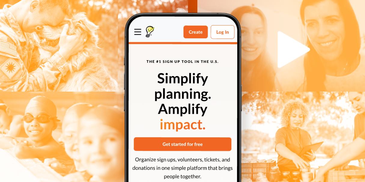
A Redesigned Homepage Built for Clarity and Mobile
The homepage has been fully refreshed on desktop and mobile with a cleaner layout, improved accessibility, and more focused messaging.
Instead of trying to do everything at once, the new homepage highlights what most people come to SignUpGenius for first: creating sign ups. From there, it introduces our full suite of tools so visitors can quickly see what’s possible.
Stackable sections and clear calls to action make it easier to scroll, tap, and take action on smaller screens.
🧠 Genius Tip: If you’re already logged in, featured product CTAs on the homepage can take you directly into the tool you need, saving extra clicks.
Simpler Navigation With Products Up Front
We’ve reworked the top navigation to make it easier to find what you’re looking for, no matter where you are on the site.
Key updates include:
- A new Products dropdown for quicker access to core tools
- Removal of the app switcher in favor of cleaner product tabs
- Login and Create buttons consistently available in the top right
- A reorganized More menu with a dedicated Search option
For logged-in users, the Account menu now includes plan details and quick access to settings, billing, and admin tools, making it easier to understand your plan and explore options when you’re ready.
New Product Pages Designed for Discovery
One of the biggest updates is the launch of dedicated product pages for each core SignUpGenius tool. These pages replace older, feature-heavy layouts and are designed to clearly explain what each product does and who it’s for.
New and redesigned pages include:
- Sign Ups (replacing the Features page)
- Payments (replacing Collect Money)
- Donations
- Auctions
- Tickets
Each page includes clearer feature explanations, updated visuals, accessible CTAs, and FAQs to help visitors find answers and take action quickly.
🧠 Genius Tip: Each product page includes direct login CTAs, so returning users can jump straight into the right tool without navigating multiple screens.
Customer Success Stories That Are Easier to Explore
Our Case Studies section has been redesigned and renamed Customer Success Stories, with a modern layout and improved browsing experience.
You’ll now find:
- Consistent visuals across desktop and mobile
- Category tabs that link to dedicated category pages
- A new search bar to find stories by use case or audience
This makes it easier to see how schools, nonprofits, businesses, and community groups use SignUpGenius in real life.
A More Modern, More Useful Blog Experience
The SignUpGenius blog has also been refreshed with a cleaner, more flexible layout.
Updates include:
- Full-width layouts for easier reading
- Improved image consistency
- New category pages to explore content by topic
- A sticky search bar to quickly find articles
Strategically placed “Create a Sign Up” CTAs help new visitors take the next step when inspiration strikes.
Designed With Accessibility and Trust in Mind
Across the site, we’ve introduced:
- Improved color contrast and readable typography
- Clearer button labels and calls to action
- More consistent layouts that reduce friction and confusion
These updates are designed to make SignUpGenius easier to use for everyone, across devices and use cases.
What’s Next
This refresh is one step in an ongoing effort to make SignUpGenius easier to use, easier to understand, and easier to grow with.
Upcoming improvements include:
- More planning guides and resources
- Helpful how-to videos and tutorials
- Product updates for a seamless experience
- Design and aesthetic changes to product to match the website
👉 Ready to explore the new experience? Visit the refreshed SignUpGenius homepage and create your next sign up in minutes.
Recent Blog Articles


SignUpGenius allowed my student organization and me to recruit and organize over 200 volunteers for a charitable event. We were able to double our volunteer force from last year thanks, in large part, to SignUpGenius. An absolutely invaluable tool that we will continue to use for years to come. Thank you so much for a perfect site and service! The ability to export the volunteers and their information to Excel saved me untold amounts of time.
CJ Quillian